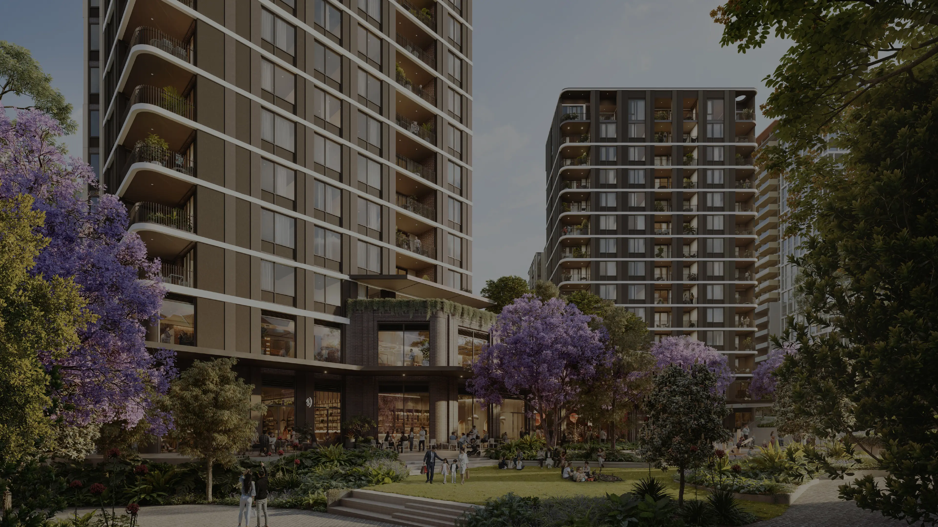
Macquarie Rise – Wayfinding
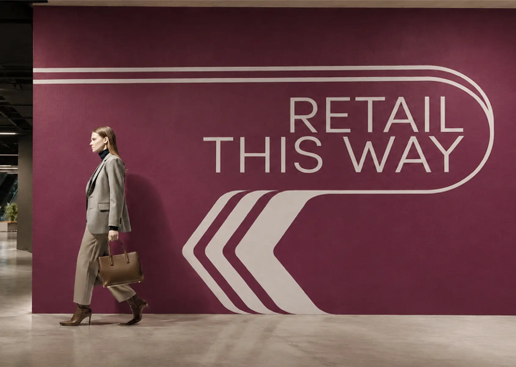
Symbolizing the continuous movement of individuals and ideas.
Introduction
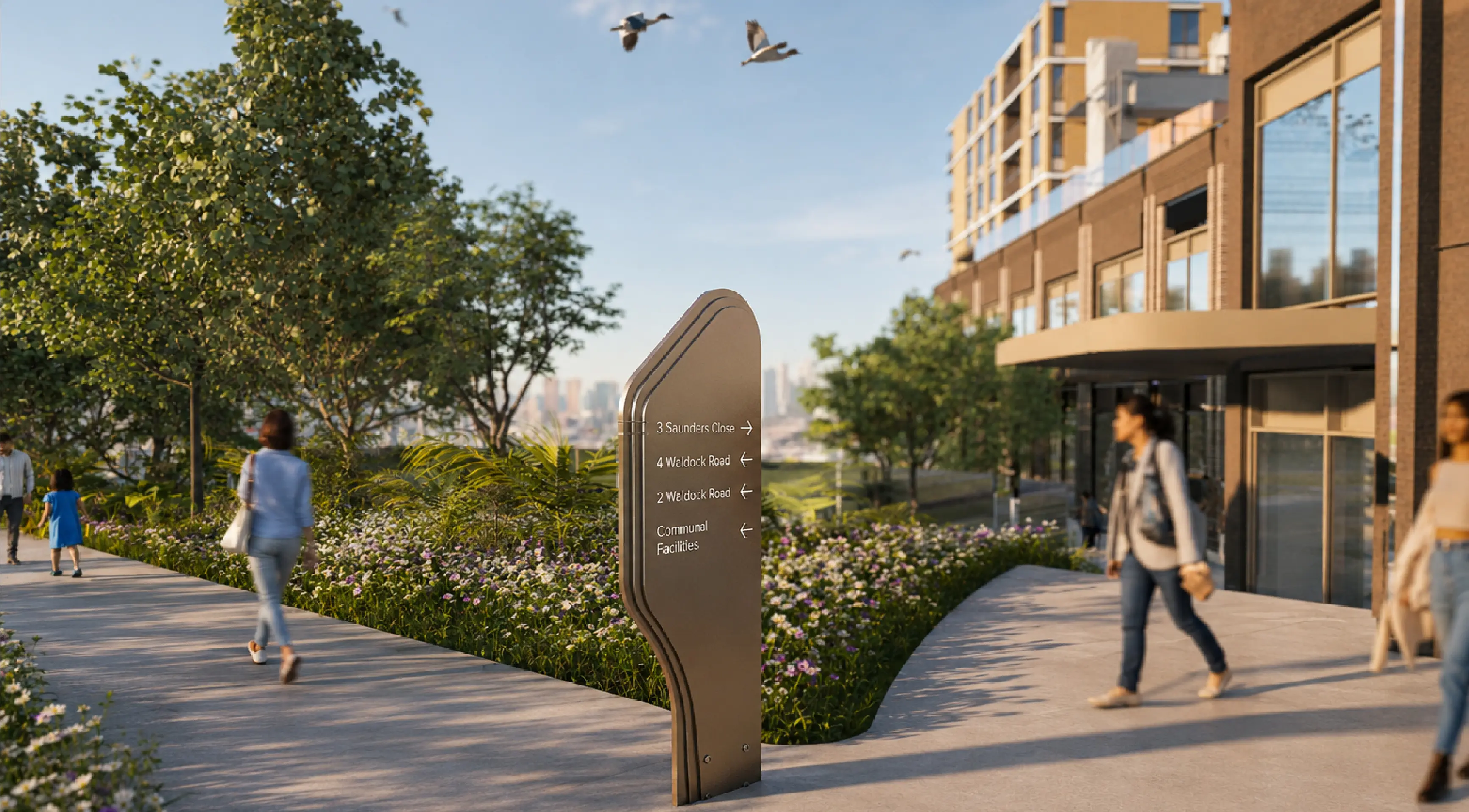
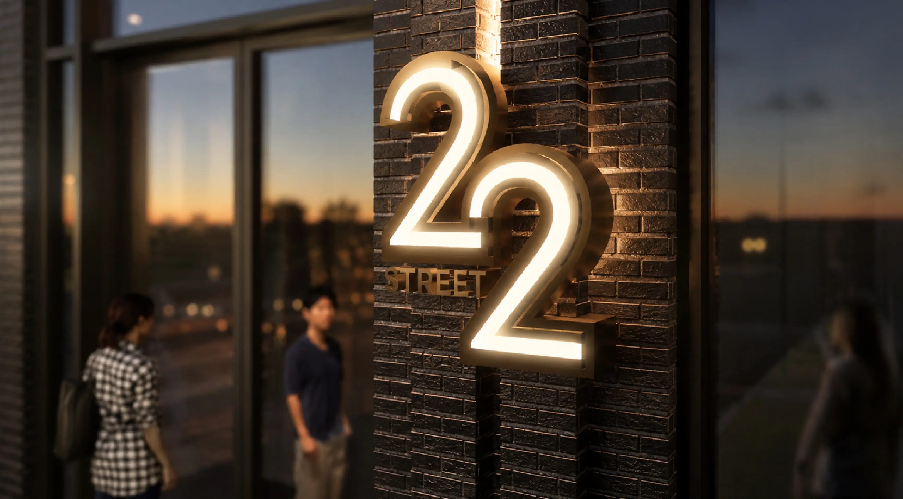
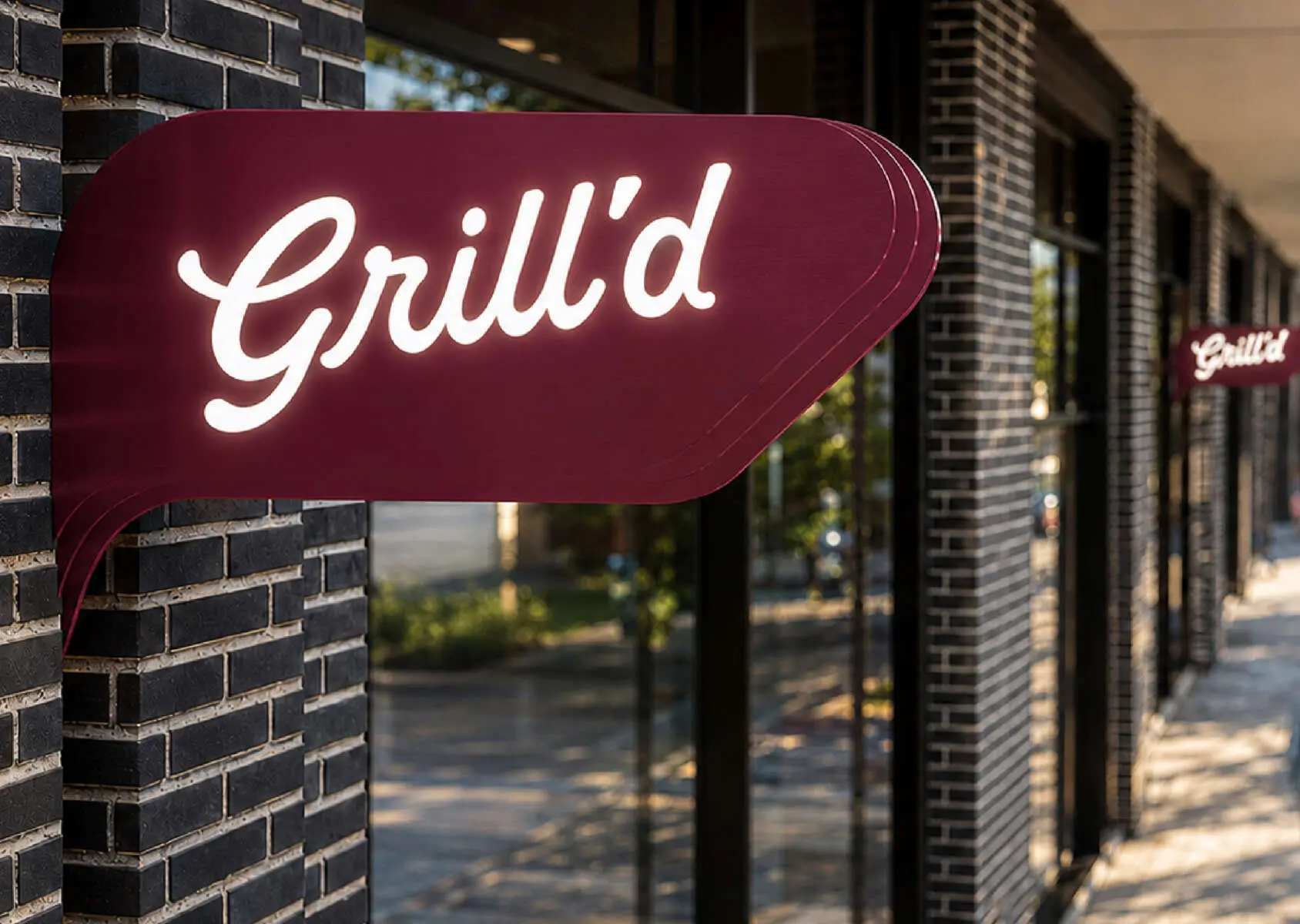
The Macquarie Rise wayfinding family draws inspiration from the architectural rhythm and curved balcony forms of the building, translating them into a soft, layered signage language that feels integrated, refined and site-specific.
Project
Macquarie Rise – Wayfinding
Client
Toga
Date
2025
Location
Ryde, NSW
Indigenous Country
Wallumedegal
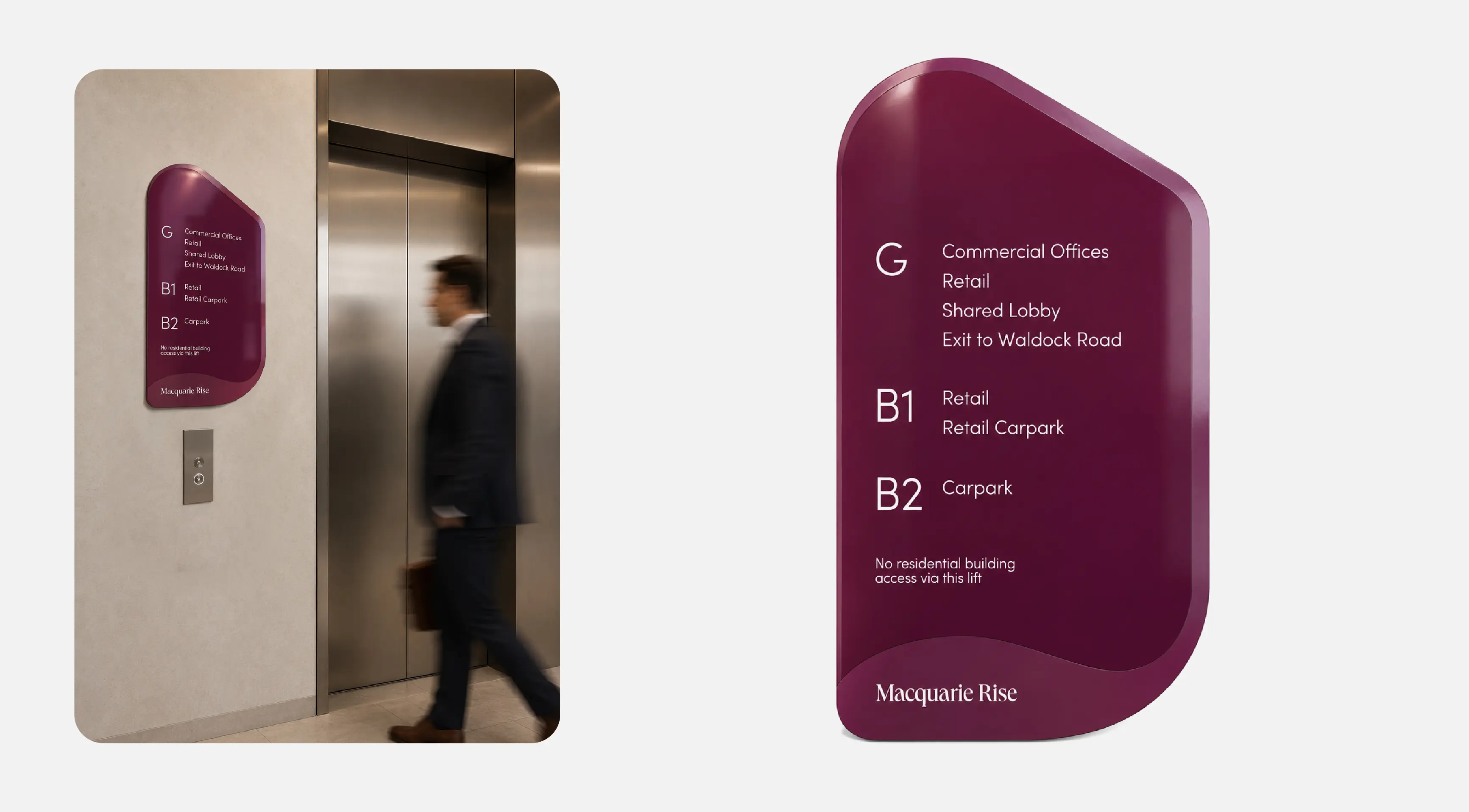
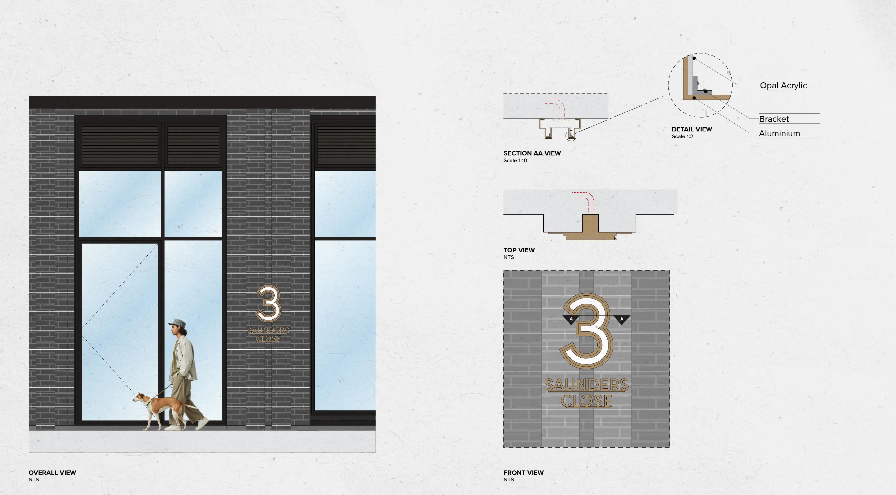
Located in Ryde, NSW, Macquarie Rise presents a mixed-use environment where residential, commercial and retail experiences come together within one precinct. The wayfinding strategy responds to this layered program by creating a cohesive family of signs that shares a common form language, while using materiality to clearly distinguish between user journeys.
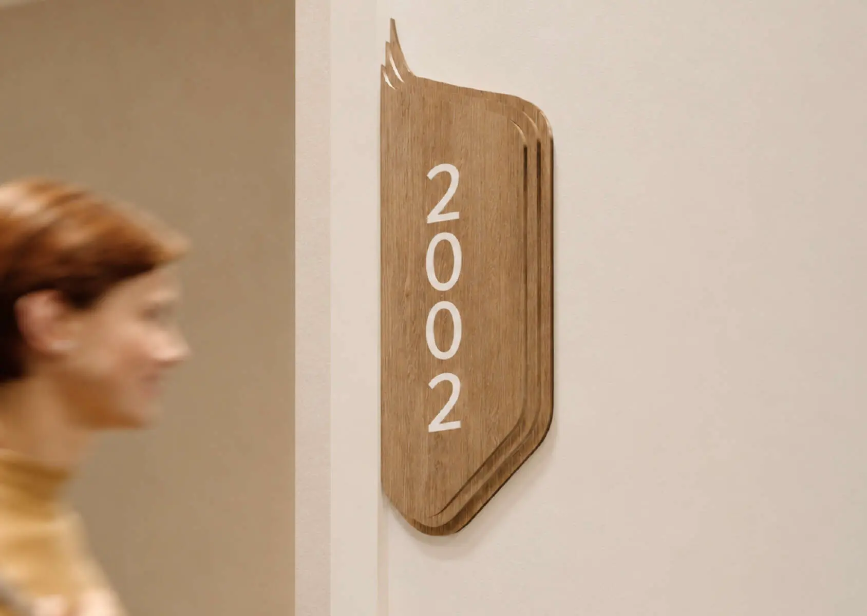
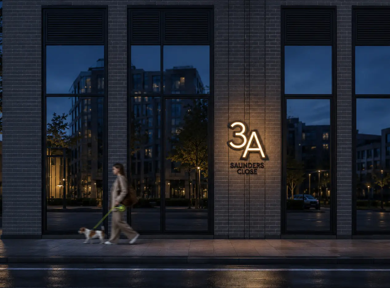
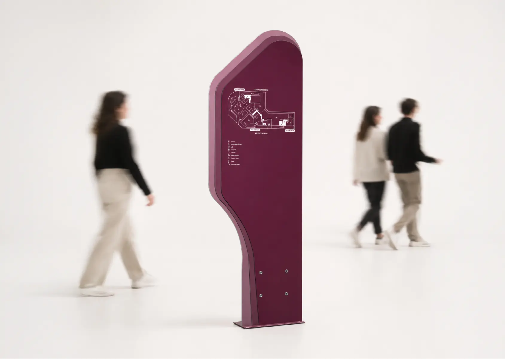
The design takes cues from the building façade, particularly its curved edges, horizontal rhythm and soft architectural detailing. These elements are translated into signage forms with rounded profiles, layered edges and tactile finishes, creating a consistent visual connection between architecture, brand and navigation.
Concept
Morling College
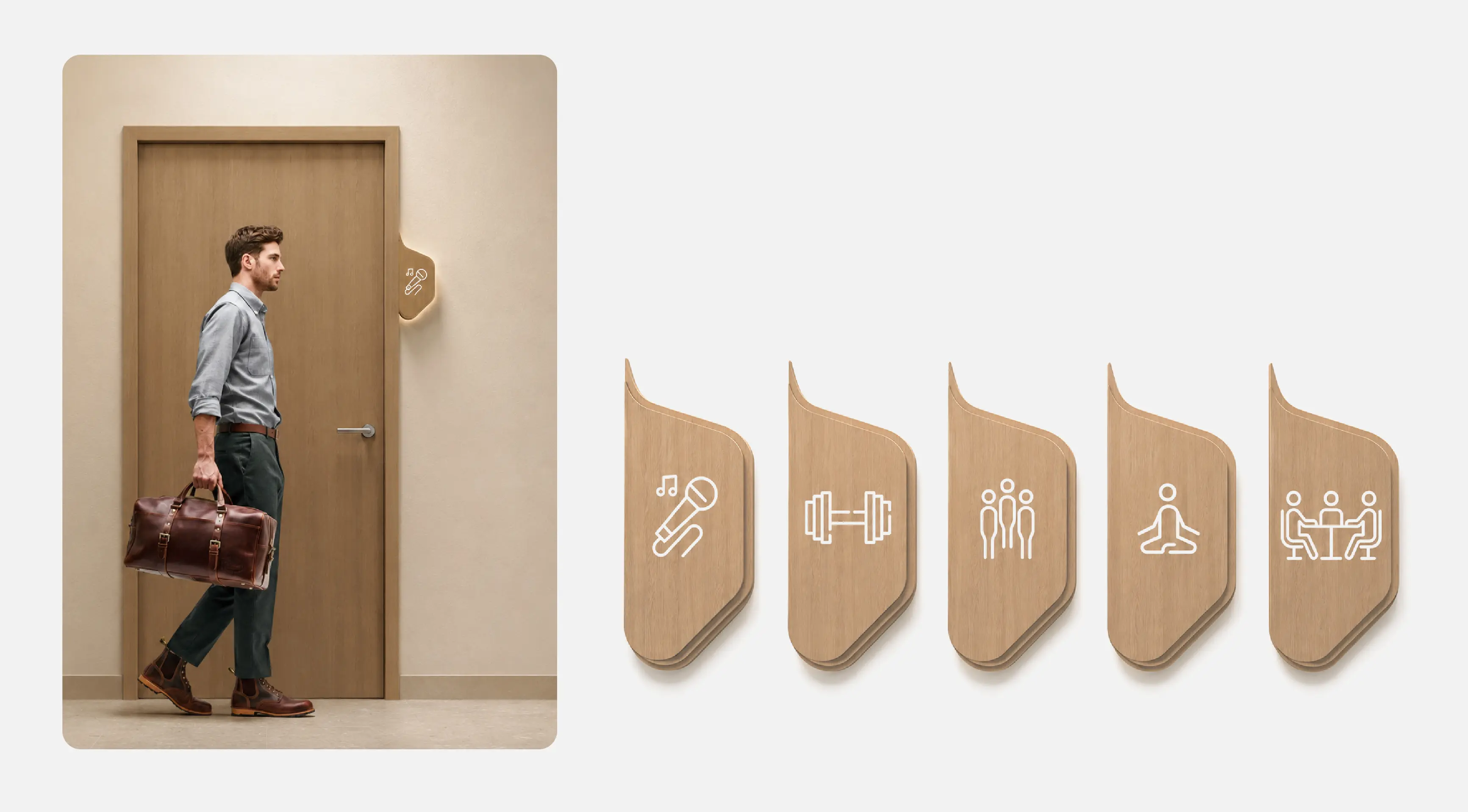
The concept is based on the translation of architectural detail into signage form. The curved balcony edges and layered façade rhythm are reinterpreted as soft, sculptural sign profiles that bring warmth, depth and identity to the wayfinding system.
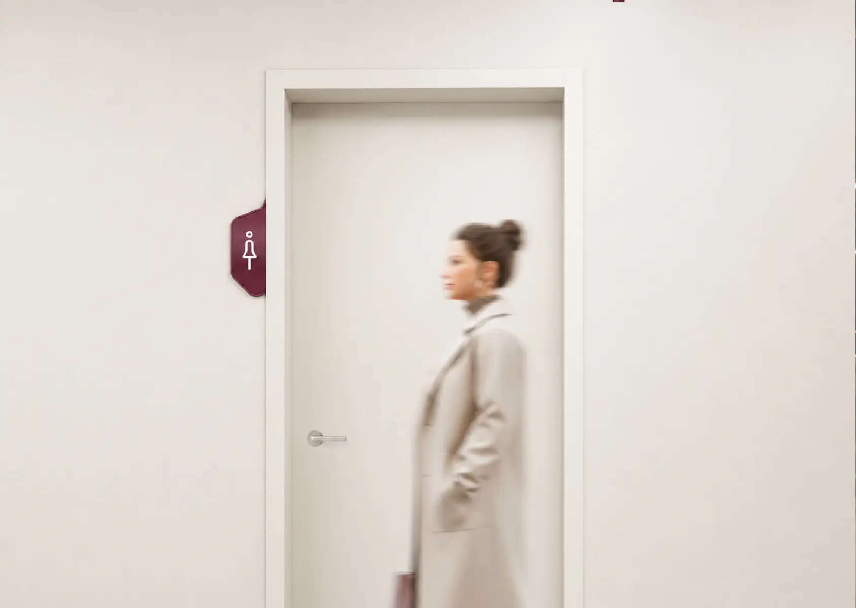
Rather than treating signage as a separate layer, the design becomes an extension of the architecture. Each sign uses curved forms and refined detailing to create a family that feels connected across the precinct, while remaining flexible across different scales, locations and user needs.
Materiality / Differentiation
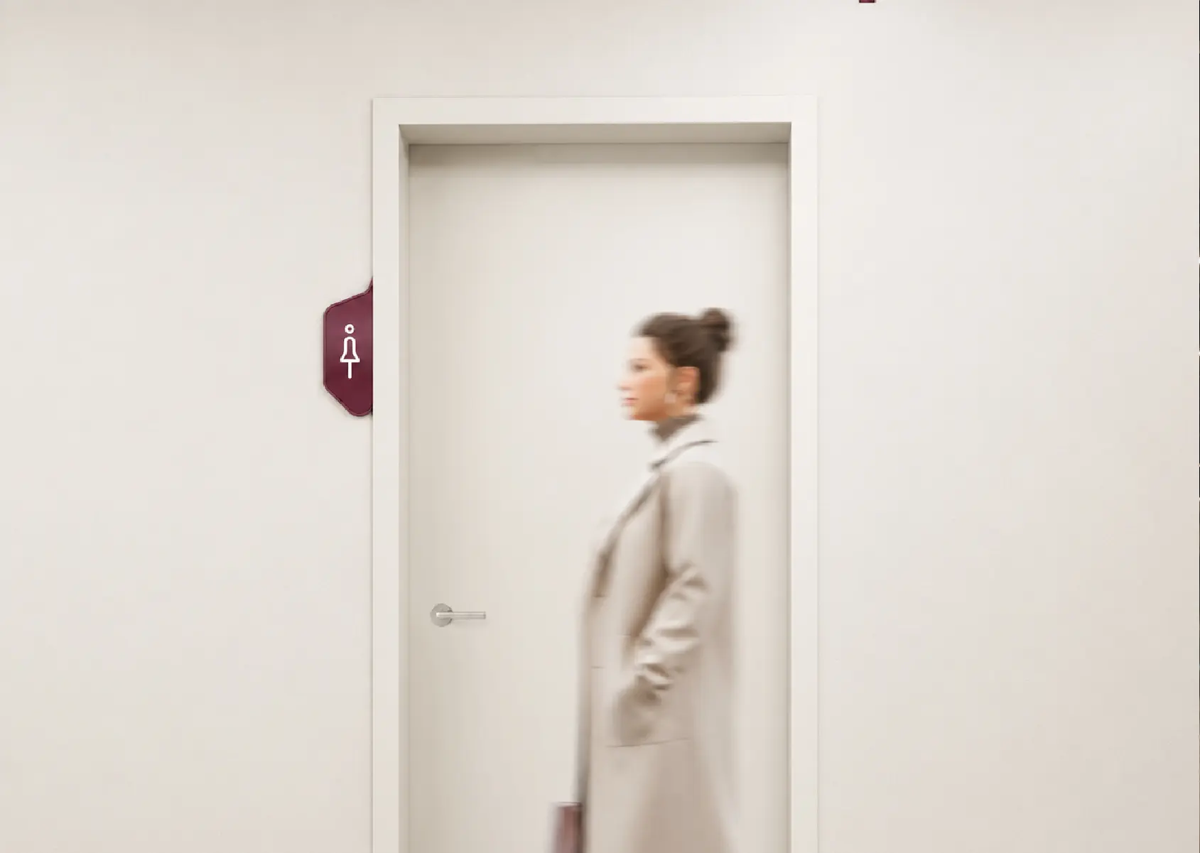
Materiality is used as a key wayfinding tool to differentiate the residential and commercial experiences within Macquarie Rise.
For residential areas, a warm timber finish introduces a softer, more personal character. This supports a calm, welcoming atmosphere for residents and helps create a sense of home, tactility and everyday familiarity.
For commercial and retail areas, a burgundy finish connects directly to the Macquarie Rise brand colours, creating a stronger and more expressive identity. This finish provides contrast, visibility and a more public-facing character, helping commercial destinations feel distinct while still belonging to the same overall design family.
Meet the team